Showing posts with label Infographic. Show all posts

Friday, August 10, 2012

The 10 Smartest People Alive Today

The 10 Smartest People Alive Today
Source: SuperScholar.org

Take a few minutes and think about what intelligence is and how you measure it? Bow ask: Is that how you would think God would define it?

The 10 Smartest People Alive Today

Wednesday, May 16, 2012

What Kind of Geek are You: The Sacred Order of Geeks

If you could put yourself in one of these categories, which one would it be?

The Sacred Order of Geeks


Share this infographic on your site!

Friday, April 20, 2012

Intel Creates Infographic Generator That's All About You

With so many posting and sharing thoughts on Facebook,Twitter, and YouTube, ever wonder what would people think is important to you if they only had these social media posts to rely on? Intel has found a way to  to take the posts, videos, and pictures you post and create a information graphic for you! Here's mine. It is not perfect, but it's still interesting. Follow the link at the end to find yours.


Intel Creates Infographic Generator That's All About You

Monday, April 2, 2012

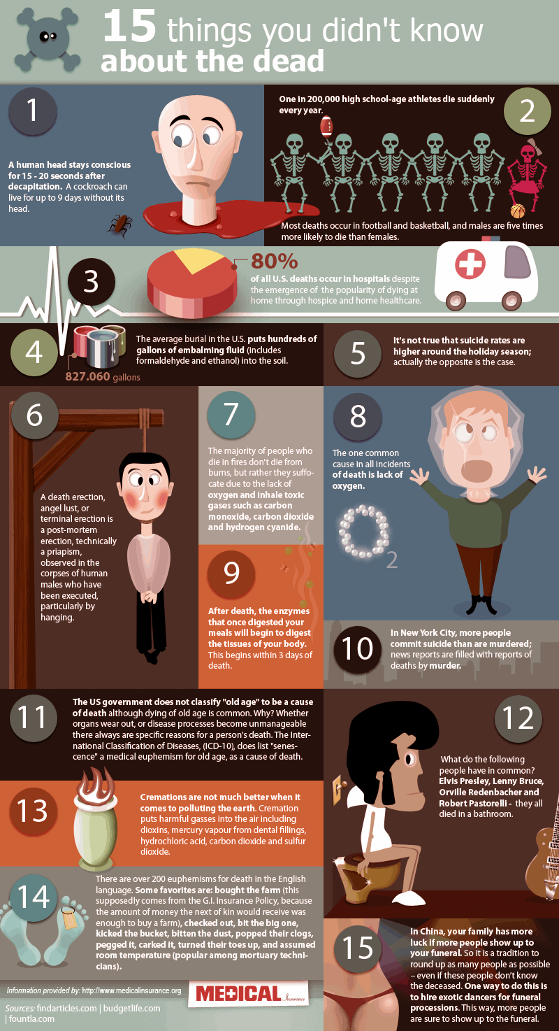
15 Things You Didn't Know About Death [infographic]

15 Things you didn't know about death

Thursday, March 8, 2012

Infographic: Two Years Later, Where Are the Haitian Recovery Funds? - News - GOOD

Here is an infographic that summarizes the recovery efforts over 2 years after the Haitian earthquake of 2010. 

 According to The Chronicle of Philanthropy, 60 aid groups have raised $2.1 billion for recovery efforts since the earthquake in Haiti two years ago. But a significant fraction of that money has yet to be spent, while half a million Hatians remain living in displacement camps and a cholera epidemic has killed more than 7,000 people.


Infographic: Two Years Later, Where Are the Haitian Recovery Funds? - News - GOOD

Thursday, September 29, 2011

Interactive Infographic: Trends in Higher Education - Education - GOOD

Here is a really cool infographic you have to try out. It's interactive and graphs the number of degrees earned in multiple fields comparing 1998 and 2008. I find it really interesting because I earned my first degree in 1997. Play around with it. The graphic even breaks the information down by gender!

Interactive Infographic: Trends in Higher Education - Education - GOOD
Enhanced by Zemanta